The Simple 3-Step Method to High-Converting Landing Pages!
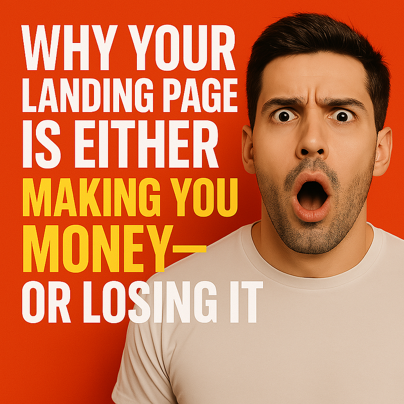
Why Your Landing Page Is Either Making You Money — or Losing It
Bullsh** aside, your landing page is the make-or-break point of every marketing campaign.
You can have the best offer in the world… You can drive insane amounts of traffic… You can even get people to click…
But if your landing page doesn’t convert, NONE of it matters.
Every dollar you earn online starts with your landing page doing its job — turning visitors into buyers.
The Biggest Mistakes That Are KILLING Your Conversions
Here’s why most landing pages fail miserably:
❌ Weak Headlines — If your headline doesn’t grab them in 3 seconds, they’re gone.
❌ Too Much Clutter — People don’t read walls of text. Keep it clear, bold, and benefit-driven.
❌ Generic CTAs — “Sign Up” means nothing. Your call-to-action needs to make clicking irresistible.
If your landing page isn’t converting, chances are you’re falling into one (or all) of these traps.
And guess what? You don’t need some expensive guru or a complicated funnel to fix it.
The Simple, Proven 3-Step Formula That Makes Landing Pages Convert Like Crazy
Here’s what high-converting marketers do differently:
⚡ Step 1: The Hook — A powerful, attention-grabbing headline that stops visitors in their tracks.
⚡ Step 2: The Value — A page structure that keeps them engaged and builds desire.
⚡ Step 3: The Close — A CTA that forces action and makes clicking feel like the only option.
If you apply these three principles, your landing page will not just get views — it will generate sales.

Now, let’s break them down step-by-step, so you can start seeing instant improvements in your conversions.
Step 1: The Hook — Crafting an Irresistible Headline
Your headline is the first thing people see when they land on your page — so if it doesn’t stop them dead in their tracks, you’ve already lost them.
Let’s be blunt — most landing page headlines suck. They’re weak, generic, and do absolutely nothing to grab attention.
If your headline doesn’t IMMEDIATELY tell visitors why they NEED to keep reading, they’ll bounce.
Why Generic Headlines Kill Conversions — And What to Do Instead
Think about the last boring landing page you clicked on. It probably had some bland, forgettable headline like:
❌ “Welcome to Our Site”
❌ “We Help You Succeed”
❌ “Check Out Our Latest Offer”
These don’t command attention, trigger curiosity, or scream value — they get ignored.
Instead, your headline needs to punch through the noise and make people feel something.
💡 A great headline taps into urgency, curiosity, or a clear, bold promise.
✔ Make them want to know more.
✔ Make them feel like they’ll miss out if they leave.
✔ Make it impossible to ignore.
Example Fix:
❌ “Start Growing Your Business Today” → “WARNING: Your Website Is Losing You Money — Fix It Now!”
❌ “Sign Up for Our Email List” → “Steal the Exact System That Gets 10–15 HOT Leads Daily!”
❌ “Learn More About Our Offer” → “How I Made $118.47 in 24 Hours — And How You Can Too!”
See the difference? One is passive, the other demands attention.
How to Craft a Bold, Attention-Grabbing Promise That Makes Visitors STOP & READ
Your headline must answer ONE question: Why should they care?

Formula for High-Converting Headlines: [Trigger Emotion] + [Specific Benefit] + [Curiosity Hook]
Examples:
✔ “The Simple 3-Step System That Converts Clicks Into Cash — FAST”
✔ “Tired of Wasting Time on Ads? Here’s the Shortcut That Works”
✔ “Don’t Even Think About Running Your Next Campaign Until You Read This”
🔥Your headline is your one shot to grab attention — make it BOLD, make it SPECIFIC, and make them NEED to keep reading.
Actionable Tip: Your Headline Must Instantly Communicate the Benefit — Or People Bounce.
If someone doesn’t understand what’s in it for them in the first 3 seconds, they’re GONE.
Before you settle on a headline, ask yourself:
✔ Does this create curiosity?
✔ Does it solve a problem?
✔ Does it scream urgency or value?
If your headline doesn’t do at least two of these things, change it — FAST.
🚨 And if you’re looking for a landing page builder that lets you test and tweak your headlines effortlessly, LeadsLeap is hands-down one of the best tools out there. You need a system that gives you speed, flexibility, and tracking to see what’s actually working — so don’t waste time with clunky, outdated page builders.
Check out LeadsLeasp by clicking HERE.
Now that your headline grabs attention, let’s move to structuring the rest of your landing page for maximum engagement — because keeping visitors hooked is just as important as getting them to click.
Step 2: The Value — Structuring Your Landing Page for Maximum Engagement
You’ve got their attention with a killer headline — but now comes the real test.
If your landing page isn’t structured to hold their focus and drive them toward action, they’ll do what most people do online: click away and never come back.

💡 Visitors don’t convert because they’re “interested” — they convert because your landing page makes them feel like they NEED what you’re offering.
The Power of Clarity — Why Cluttered, Confusing Pages Destroy Sales
Ever landed on a page with too much text, random distractions, and a dozen different choices?
It’s overwhelming. It’s frustrating. And most importantly? It kills conversions.
Clarity = Conversions. The fewer distractions, the more likely people are to follow the path you want them to take.
Here’s how to keep it laser-focused:
✅ One clear offer — no side promotions, no off-topic content
✅ Simple, scannable sections — short paragraphs, bullet points, bolded takeaways
✅ Minimalist design — no flashy animations, cluttered layouts, or unnecessary links
🔥 If a visitor can’t tell what your page is offering in 3 seconds, they’re gone. Keep it simple. Keep it direct.
The Perfect Landing Page Structure That Keeps Visitors Engaged & Pushes Action
High-converting landing pages follow a proven structure:
✔ Attention-Grabbing Headline → Stops them in their tracks
✔ Clear Benefit Statement → Shows them exactly why this offer matters
✔ Strong Visuals & Proof → Testimonials, stats, or imagery that reinforce credibility
✔ Irresistible CTA → A bold, action-driven button that demands a click
🔥 Think of your landing page like a funnel — every section should pull them closer to the action.
The biggest mistake? Adding too many choices — giving people too many buttons, links, or distractions stops conversions dead.
🚨 One focus, one action, one goal. That’s what sells.
How to Write Benefit-Driven Copy That Makes People Feel Like They NEED What You Offer
Most landing page copy is a disaster because it focuses on features instead of benefits.
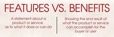
❌ Feature-focused example: “Our software has advanced analytics and customizable dashboards.”
✅ Benefit-driven example: “See EXACTLY what’s driving your sales — so you can double your profits faster.”
People don’t care about what your offer does — they care about how it makes their life easier, faster, or more profitable.
Use benefit-driven language everywhere:
✔ Make it feel exclusive (“Get instant access before it’s gone!”)
✔ Speak to pain points (“Struggling with [problem]? Here’s the fix.”)
✔ Keep it simple (“No fluff, just results. Try it now.”)
If your landing page doesn’t speak directly to a pain point, it won’t convert. Your copy should make people feel like they’ve found the missing piece to their success.
🚨 And if you want a landing page builder that makes structuring pages effortless, once again, LeadsLeap is hands-down one of the best tools you’ll find. It lets you test, tweak, and refine your pages for maximum conversions — without the tech headaches or guesswork.
Check out LeadsLeap by clicking HERE.
Now that your page grabs attention, holds engagement, and builds desire, the next step is forcing action with an irresistible CTA — because without a click, none of this matters.
Step 3: The Close — Creating a CTA That Forces Clicks
Let’s be brutally honest — if your call-to-action (CTA) isn’t compelling, your landing page is dead in the water.
🚨 You could have the best offer… 🚨 The perfect headline… 🚨 A flawless design…
But if your CTA doesn’t MAKE people click, all of that effort goes to waste.
Your CTA isn’t just a button — it’s the final push that makes visitors say, “I HAVE to do this right now.”
How to Craft an Irresistible Call-to-Action That Gets Clicks
Here’s the mistake most marketers make:
❌ They play it safe with boring, weak CTAs like…
- “Sign Up Now”
- “Submit”
- “Learn More”
These don’t inspire action — they feel passive, forgettable, and easy to ignore.

A powerful CTA taps into urgency, excitement, and clear benefits.
Formula for High-Converting CTAs:
⚡ [Command Action] + [Benefit] + [Urgency]
📢 Examples:
✔ “Unlock Instant Access & Start Earning Today!”
✔ “Get My Exclusive Blueprint Before It’s Gone!”
✔ “Claim Your Free Traffic Method — Limited Spots Left!”
The goal? Make clicking FEEL like the natural next step — not an option.
The CTA Placement Strategy That Makes Action Feel Inevitable
Where you place your CTA matters just as much as how it’s written.
Here’s the winning strategy:
✅ Above the fold — First thing they see = maximum engagement
✅ Mid-content CTA — Reinforces action once they’re invested
✅ Final push CTA — No distractions, just a clear path to the next step
💡 Pro Tip: Add urgency triggers around your CTA for extra firepower. 📢 Example: “Limited Spots Available — Don’t Miss Out!”
CTA placement should gently guide the visitor toward action — without feeling forced.
The Biggest Mistakes in CTA Design (And How to Fix Them)
Mistakes that KILL conversions:
❌ Small, hard-to-read buttons — Make it BIG and BOLD.
❌ Weak contrast — Your CTA should pop off the page.
❌ Unclear direction — Make the action obvious and desirable.
✅ Fix it with:
✔ A high-contrast button color that stands out
✔ Powerful, benefit-driven CTA copy
✔ A sense of urgency to create FOMO
Make clicking feel inevitable — not optional.
Actionable Tip: Never Use ‘Sign Up’ or ‘Submit’ — Make Your CTA About THE BENEFIT.
Nobody wants to “Sign Up” — they want the RESULT of signing up.
Think about it: Would you rather see…
❌ “Sign Up”
or
✅ “Get Your Free Cheat Sheet & Start Winning”?
Make your CTA exciting, bold, and focused on the transformation — NOT just the action.
🚨 LeadsLeap allows you to easily test CTA variations to optimize your conversins. It lets you split-test different CTA styles, placements, and copy — so you KNOW what works, instead of guessing.
Now, you’ve got the perfect headline, page structure, and CTA — but how do you monetize it FAST and start generating consistent traffic?
Stay tuned — because the final step is where things get REALLY interesting.

Final Step: The Shortcut to High-Converting Landing Pages & Instant Buyer Traffic
At this point, you’ve got all the core ingredients for a landing page that converts. You know how to grab attention, hold engagement, and drive clicks.
But here’s where most marketers completely drop the ball…
They assume good landing pages are enough to make sales.
Let me break it to you — they’re NOT.
A landing page without targeted traffic is just a fancy webpage sitting in the void, doing absolutely nothing. 💡 No clicks = No conversions = No money.
That’s why the REAL secret behind high-converting landing pages isn’t just design — it’s TRAFFIC.

Why Most Marketers Struggle With Traffic & Conversions — Until They Use THIS
Here’s what happens to 99% of marketers:
❌ They build a landing page.
❌ They wait for traffic.
❌ Nothing happens.
Then they start wasting time on social media posts, hoping for organic visitors, or worse — throwing money at paid ads that barely convert.
That’s NOT how the pros do it.
Successful marketers use buyer-ready traffic — the kind that’s ALREADY primed to convert.
🔥 No cold outreach.
🔥 No waiting for Google to rank you.
🔥 Just instant, targeted visitors who are READY to buy.
The Fastest Way to Monetize & Scale Your Landing Pages
If you’re serious about turning your landing page into a real profit machine, you need traffic that does the heavy lifting for you.
And the fastest way? Plug into a system that gives you proven, high-converting traffic from DAY ONE.
Instead of:
❌ Spending months figuring out how to drive visitors
❌ Wasting cash on ads that may or may not work
❌ Hoping for random traffic that never converts
You take the shortcut — the system that delivers traffic FOR YOU.
🔥 If you want an all-in-one shortcut that takes landing pages AND conversions to the next level — this is where things get exciting…
Click below to learn how to get BUYER Traffic: